DebX App Design

The task was to design the Dashboard for DebX application. It was important to present data about funds, payments, cards and payment services in a very convenient way.

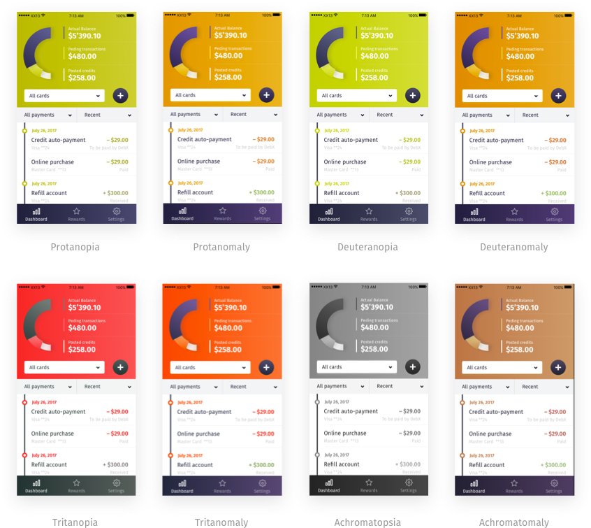
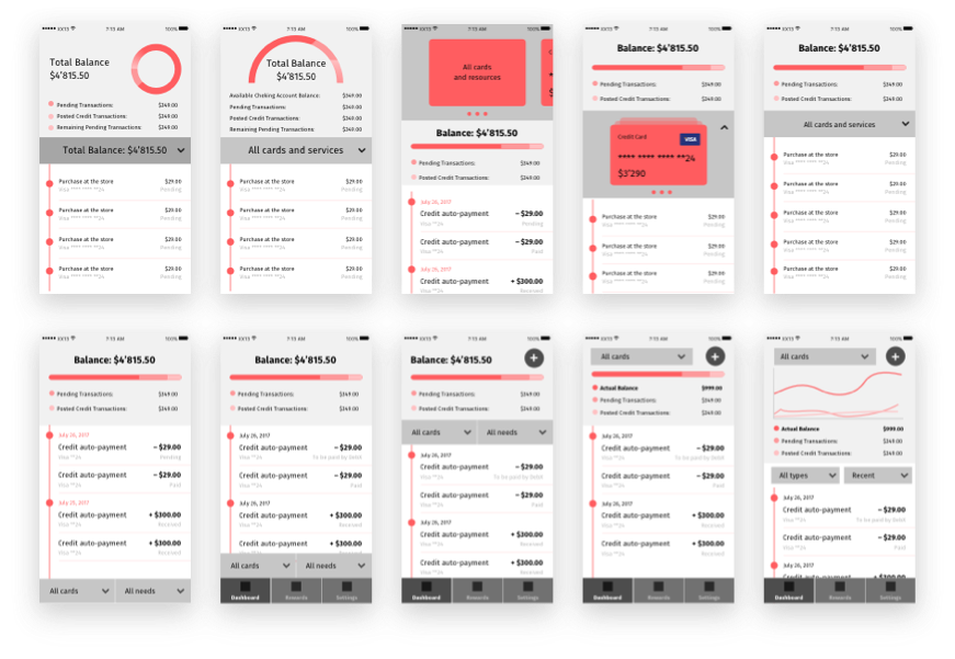
Research & Prototyping

I made some research and prototyping to be sure that the dashboard meets user's needs.

All functions, filters are easy to reach, quite obvious. Still the screen doesn't look overwhelmed with information and remains rather spacious. White space helps to work with data.

Accessibility Test

As some color coding was used, I also double checked that everything will work for color blind clients, all types of the disease.

Using Screen Efficiently

Dashboard screen switched to the alternative layout when a user starts scrolling. That way payments will cover more space on the screen, so it will be easier to work with them. Card funds overview and card/source control remain accessible at the top.

Dashboard Controls & Filters

There were a number of things to keep in mind while designing the Dashboard screen:

Made by Vasili Savitski